CASE STUDY: FILENSE BETA ACCESSIBILITY EVALUATION
Unsolicited Accessibility Audit | Personal Finance Web Application
WAVE & axe DevTools | WCAG 2.2 AA | June 2026
Project Context:
Accessibility Evaluation engagement | Filense personal finance web application | Contract, June 2026
Role: Beta Tester & Accessibility Specialist, LIFTUPS™ Digital Consulting, WOSB
Tools: WAVE (WebAIM), axe DevTools (Deque, axe-core 4.11.4), Manual Evaluation
Standard: WCAG 2.2 Level AA | Windows 10, Chrome
If a Beta Tester Cannot Access Your App, You Have Already Started at the Wrong Place
This Filense accessibility audit began as a paid beta test. The client, a solo developer building a personal finance web application, contracted testers to complete a standard sign-up flow and submit feedback through a Google Form survey focused on UI and visual design.
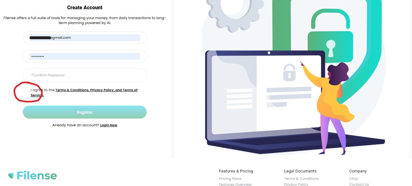
The app could not be accessed. Not because of a technical outage, not because of a password error, but because a required checkbox on the registration page was completely invisible. No border. No background. No label. It blended into the page so thoroughly that the only way to find it was to run a professional accessibility scanning tool.
This is what happens when accessibility is treated as an afterthought. The developers had built a login page, a registration form, a profile builder, an onboarding flow, a dashboard, and a full suite of financial planning features. They had also, somewhere in the process, forgotten to make a checkbox visible. That one invisible element stopped every user who did not already know it was there.
Rather than stopping at the survey, a full accessibility evaluation was conducted across every page reachable during the session. The client did not request this. It was produced out of professional necessity: a usability survey cannot honestly be submitted about a platform that fails at the most basic threshold of being usable.
Accessibility is not a feature to be added after a product is built. It is a foundation that determines whether the product can be used at all.
The Cost of Building Backwards
The developer’s response to the evaluation was that accessibility was not a concern for a beta prototype, and that the releasable product was a mobile app. This is one of the most common and most costly positions a developer can take.
The data tells a different story. In 2025, more than 5,000 digital accessibility lawsuits were filed in the United States, a 27% increase over 2024. Settlement costs typically range from $5,000 to $75,000, not including attorney fees, required redesign costs, and court-ordered monitoring. An estimated 35,000 to 50,000 demand letters were sent in 2025 before cases even reached the courts. Nearly half of all companies sued in 2024 had already been sued before for the same violations. They had been warned and did not act.
Mobile apps carry the same exposure. The ADA Title III framework that applies to websites applies equally to mobile applications. The DOJ’s 2024 final rule adopting WCAG 2.1 Level AA as the technical standard for public-sector digital properties has accelerated expectations for private-sector platforms as well, particularly those in financial services where the stakes for excluded users are highest.
Accessibility built in from the start costs a fraction of what it costs to retrofit after a lawsuit. And retrofit after a lawsuit means losing users, losing trust, and rebuilding under legal supervision, on a deadline, in public.
The developer also attributed the written findings to AI generation, an increasingly common dismissal of professional work that happens to be clearly structured and well articulated. The irony of dismissing an accessibility evaluation as AI-generated while shipping an inaccessible product was not lost. The findings were produced using industry-standard tools and professional methodology. The invisible checkbox was real. The 218 ARIA issues on the transactions page were real. The 4.5 out of 10 dashboard accessibility score was real. None of those required AI to find. They required expertise.
A Note on Modern Bias, Literacy, and the “AI” Excuse
In the current tech landscape, a defensive and deeply problematic trend has emerged among product owners who receive high-fidelity, structurally rigorous critique: assuming that a polished, deeply analytical report must be the product of generative AI simply because it surfaces uncomfortable truths.
Let’s be clear: Command of language, meticulous attention to detail, and flawless execution are human standards of excellence, not machine inventions. For decades, Black women and people of color in professional spaces have had their literacy, handwriting, syntax, and speech policed under the guise of backhanded compliments like “you speak so eloquently”, “where did you do to school” or “your writings are so well-written.” The underlying expectation was that we were supposed to be illiterate (or “low IQ”).
Today, that identical bias has simply found a new, sanitized cover story. Instead of questioning a person’s education, early-stage startup founders now look at elite human precision and competency and use “AI” as a convenient, modern cover to undermine the intelligence of women of color.
Large Language Models were trained on the industry-standard frameworks, technical writing, and structured taxonomies established by human specialists over generations. When a human professional documents findings with maximum clarity, structured tables, and analytical prose, the writing doesn’t look like a machine; the machine looks like us.
Dismissing an exhaustive, manual human evaluation as “AI-generated” because the findings expose critical flaws is a failure of leadership, product maturity, and personal accountability. At LIFTUPS™, we deliver uncompromising truth to ensure your product survives the real market. We do not dilute our reporting frameworks or lower our standards of excellence to comfort a fragile product deployment.
A meticulously placed em dash isn’t evidence of an algorithm, nor does it mean a human expert “adds no value” to a beta test. It is a direct reflection of a rigorous, unyielding standard woven into my professional DNA by Brad Plevyak—a formidable former manager and leader who would relentlessly reject my documentation if I dared use a lazy hyphen. Because our government machines lacked an em dash key, he once sent me an email, “Subject: em dash copy paste” so I could manually copy the symbol and maintain absolute typographic precision in our federal reporting.
I carry that exact email, and that exact battle-tested discipline, into every piece of documentation I touch today. My formatting isn’t a machine’s prompt output; it is a hard-earned human signature forged under a leader who demanded excellence.
If the results are uncomfortable, the solution is to fix your code, not blame the mirror.
What the Filense Accessibility Audit Found
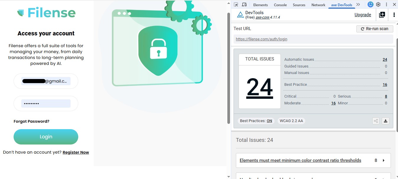
Both WAVE and axe DevTools were run on every page accessible during the session. WAVE assigns each page an AIM Score from 0 to 10. A score below 7.0 indicates real barriers for users with disabilities. axe DevTools categorizes issues as Critical, Serious, or Moderate based on impact to assistive technology users.
WAVE AIM Scores by page:
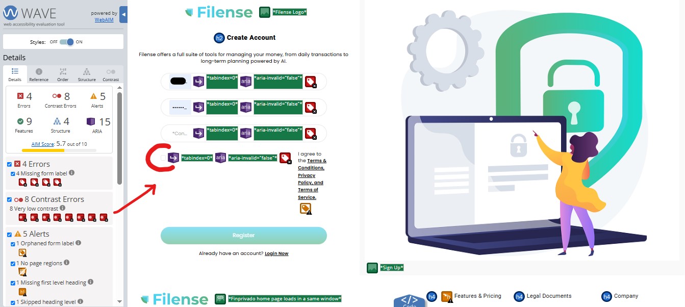
- Registration page: 5.7 out of 10
- Profile form page: 5.7 out of 10
- Email verification page: 6.6 out of 10
- Finance setup page: 8.5 out of 10 (strongest page tested)
- Dashboard: 4.5 out of 10 (lowest score, most critical page)
- Transactions Review page: 4.4 out of 10
axe DevTools issues by page (WCAG 2.2 AA):
- Registration page: 26 total — 1 Critical, 8 Serious, 17 Moderate
- Profile form page: 29 total — 1 Critical, 8 Serious, 20 Moderate
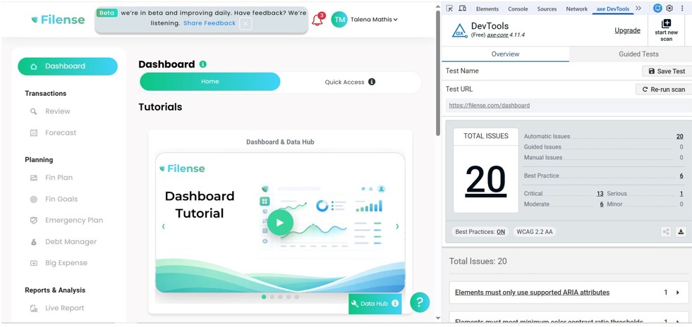
- Dashboard: 20 total — 13 Critical, 1 Serious, 6 Moderate
The Invisible Checkbox: Where It All Started
After multiple failed attempts to submit the registration form with no error message and no feedback, WAVE was run on the page. The scan immediately flagged a required Terms and Conditions checkbox with no visible border, no background color, and no programmatic label. Once located and checked, the account was created immediately. Approximately thirty minutes had passed.
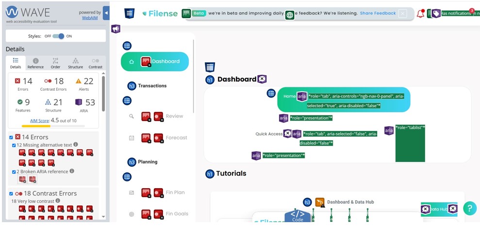
The Dashboard: The Most Important Page, The Lowest Score
The main dashboard, the first page every user sees after getting started, received the lowest accessibility score of any page tested: 4.5 out of 10. It had 14 errors, 18 contrast errors, 22 alerts, and 53 ARIA issues. 12 tutorial images had no alternative text, meaning a screen reader user arriving on the dashboard for the first time would hear nothing meaningful about the page’s primary content.
The teal-to-green gradient used throughout the entire application on buttons, navigation highlights, banners, and cards is the root cause of the sitewide contrast failures. Gradient backgrounds make it technically impossible to guarantee consistent contrast because the color shifts across the element. This is not a stylistic observation. It is a documented accessibility failure across every page tested. The fix is a design system level decision, not a page-by-page patch.
218 ARIA Issues on a Single Page
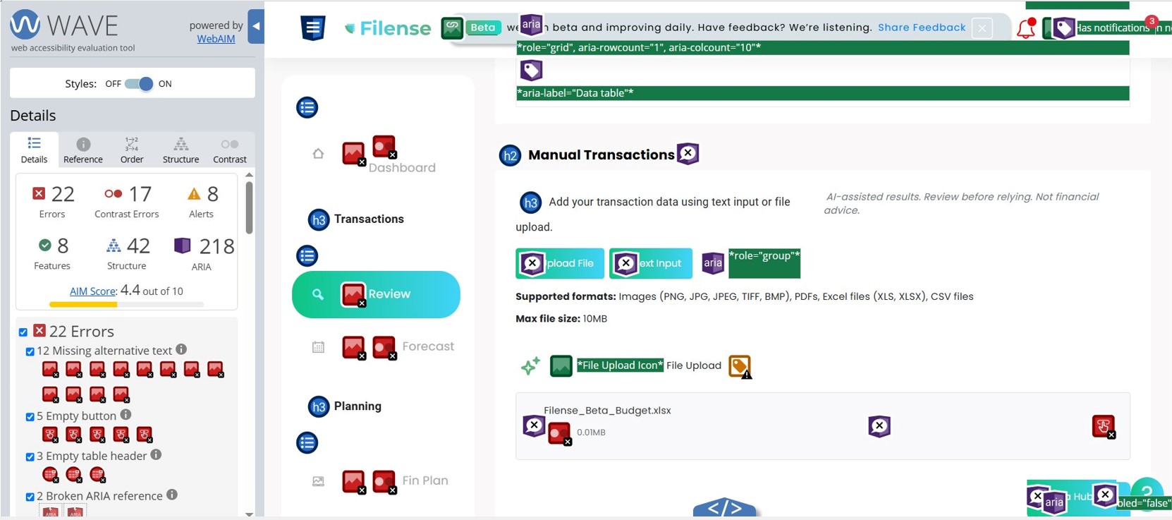
The Transactions Review page, where users manage their financial records, produced 218 ARIA issues. That number is not a typo. The data grid used to display transaction data has fundamental structural problems that render it completely unusable for anyone relying on a screen reader. A person using assistive technology to manage their own finances, which is precisely what this app is designed for, would be unable to interact with any of the transaction data on this page.
What the App Does Well – Update
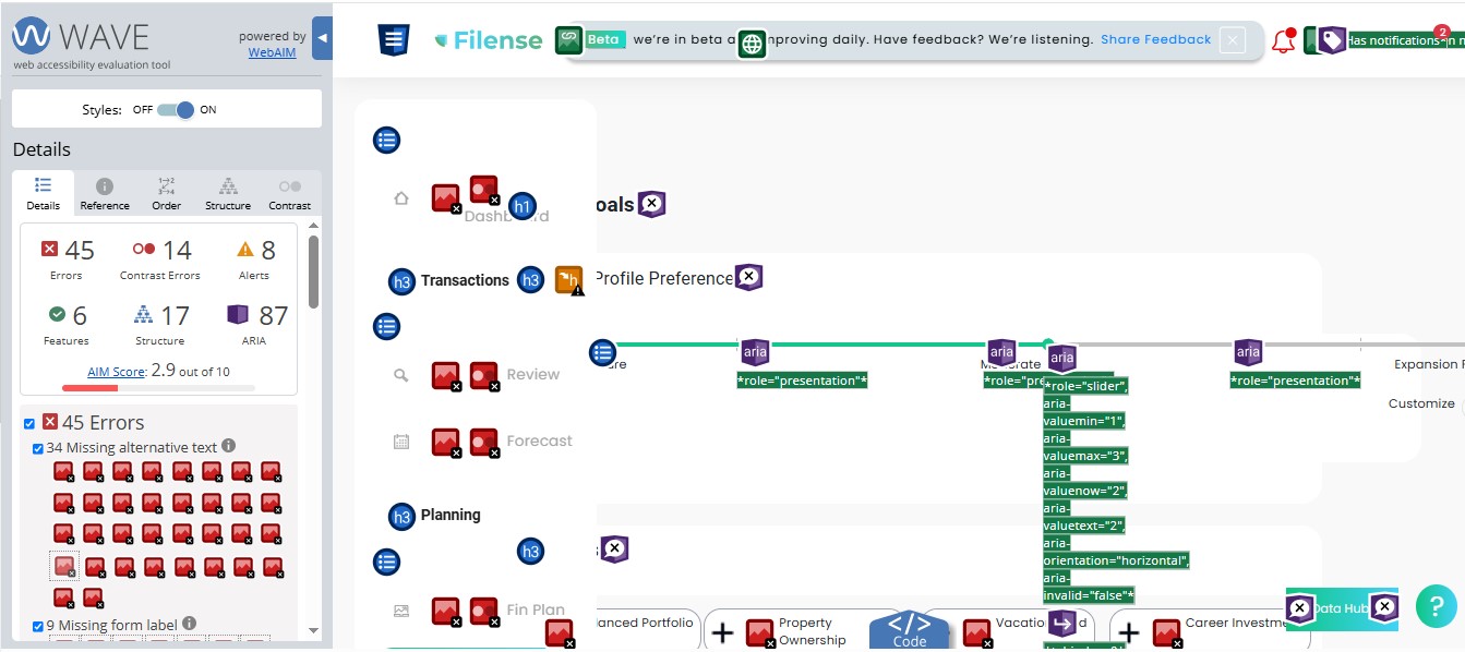
An earlier version of this evaluation noted the Filense Goals page as the strongest page in the application based on the session tested on June 12, 2026. A subsequent scan conducted after the initial report was submitted tells a different story.
The Goals page now scores 2.9 out of 10 — the lowest score of any page evaluated across the entire application. 45 errors were identified, including 34 images missing alternative text and 9 missing form labels. Every goal category card displayed on the page — Balanced Portfolio, Property Ownership, Vacation, Career Investment, Career Development, Credit Health, Growth Funds, Diversified Savings, Lifestyle Planning, Cultural Experiences, Tech Upgrades, Fitness Goals, Financial Literacy, Special Events, Gift Planning, and Loan Prepayment — has an icon with no alternative text. A screen reader user navigating this page would hear nothing about any of these categories. 87 ARIA issues were also flagged, including an ARIA slider component with multiple state attributes present but implemented incorrectly, meaning the element announces properties to assistive technology that do not reflect actual behavior.
This update is noted here in the interest of accuracy. The original observation that the team is capable of building clear, well-structured interfaces still stands based on the field layout observed during the initial session. The accessibility implementation of that page, however, does not currently support that conclusion.
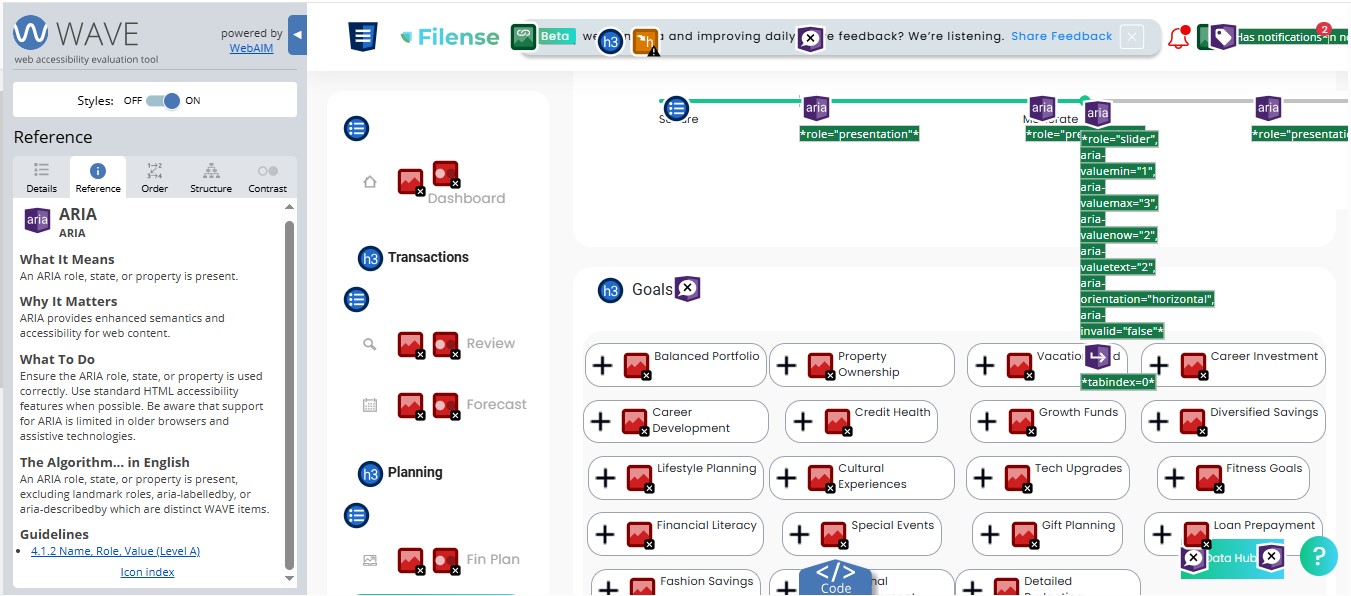
A Closer Look at the 87 ARIA Errors
ARIA stands for Accessible Rich Internet Applications. It is a set of attributes added to HTML elements to give screen readers and other assistive technologies additional information about what an element is, what state it is in, and how it behaves. When used correctly, ARIA bridges the gap between a visual interface and what a screen reader announces to the user. When used incorrectly, it creates a worse experience than no ARIA at all.
The Goals page contains a component using the following ARIA attributes: aria-valuemin, aria-valuemax, aria-valuenow, aria-valuetext, aria-orientation, and aria-invalid. On the surface that looks like accessibility effort. The problem is that these attributes are applied to an element that does not actually function as a slider in practice.
When a screen reader encounters aria-valuemin and aria-valuenow, it announces the element as a slider and reads the values aloud. If the element does not behave like a slider, or the values do not update when a user interacts with it, the screen reader is providing false information. The user hears “slider, minimum 1, maximum 3, current value 2” and attempts to interact with it accordingly. Nothing responds the way the announcement suggested it would.
This is a recognized pattern called ARIA misuse and it is directly addressed by WCAG 4.1.2 Name, Role, Value. The standard is clear: if you declare a role and its associated states and properties, the element must actually behave that way.
Using ARIA incorrectly is the equivalent of putting a push sign on a door that pulls. The sign is present, the user follows it, and they still cannot get through. For users relying on assistive technology, that is not a minor inconvenience. It is a complete barrier to using the feature.
The fix here is straightforward: either use a native HTML range input, which is natively accessible and requires no ARIA, or implement the ARIA slider pattern correctly with full keyboard support and live value updates that match what is being announced. This is a development correction, not a design one.
Why This Matters Beyond One Beta Test
Approximately 26% of U.S. adults live with a disability. Fintech platforms are increasingly replacing traditional bank branch access. A person who cannot use a financial app because of accessibility barriers has been excluded from managing their own money, and the platform that excluded them may not know it happened because that user simply left and never came back.
The legal pressure is real and rising. More than 5,000 digital accessibility lawsuits were filed in 2025, a 27% increase over 2024. Settlements range from $5,000 to $75,000 before legal fees and required remediation. In 2024, 46% of federal cases involved companies that had already been sued before for the same violations. The pattern is consistent: companies are warned, they do not act, and they are sued again.
The 2024 WebAIM Million study found that 95.9% of major website homepages failed basic accessibility checks. That means inaccessibility is the industry default, not the exception. Building accessibly from the start is not a competitive disadvantage. It is the thing that separates a platform that survives legal scrutiny from one that does not.
This evaluation was not requested. It was produced because accessibility cannot be evaluated as an afterthought by the person being asked to test the product, any more than it can be built as an afterthought by the team that built it. If the first thing a user has to do is run a professional scanning tool to find a checkbox, the product is not ready.
Reflection
The thirty minutes spent trying to create an account were not wasted time. They were the finding. A developer who tests their own product never encounters an invisible checkbox because they know it is there. A real user does not. That gap between what the builder sees and what the user experiences is exactly what accessibility evaluation exists to close.
The Goals page in this same application shows what thoughtful design looks like. The capability is there. The commitment to applying it consistently across every page, before launch rather than after a demand letter, is the decision that determines whether a product with genuine potential actually reaches the people it was built for.
Need an accessibility evaluation before your next launch? Contact me